Monday 10 December 2012

Alternative Techniques-Blaydon Tennis Club

Given the short space of time I had available after producing a range of initial ideas and development, I feel the final pieces I created were quite suited to their task, one of which I personally prefer much more then the other. As a brief overall, including my Harbour House work, I feel this is one of my more successful briefs. In terms of research I have delved much deeper into the area I am working in giving me a greater understand of what is suitable and aiding my initial ideas generation. Particularly in my Harbour House work, I have been able to produce a wide range of ideas based on my research and have applied in different formats suited to the field of branding.
My first final piece, the one I prefer less, was my type based. Normally not one for typographic work, I thought that I would give myself a small challenge by forcing myself to work out of my comfort zone. So I dabbled, very simply, in the creation of a font using, predominantly, the shape tools and the pathfinder functions. While I quite like the font I have created, as an overall piece, I was left feeling quite disappointed by the result, perhaps had it been placed in situ somehow, it may have looked more suitable, but it is unlikely. Quite simply, it's too simple, I do not mind the style of the font, but on it's own, it lacks any real impact.
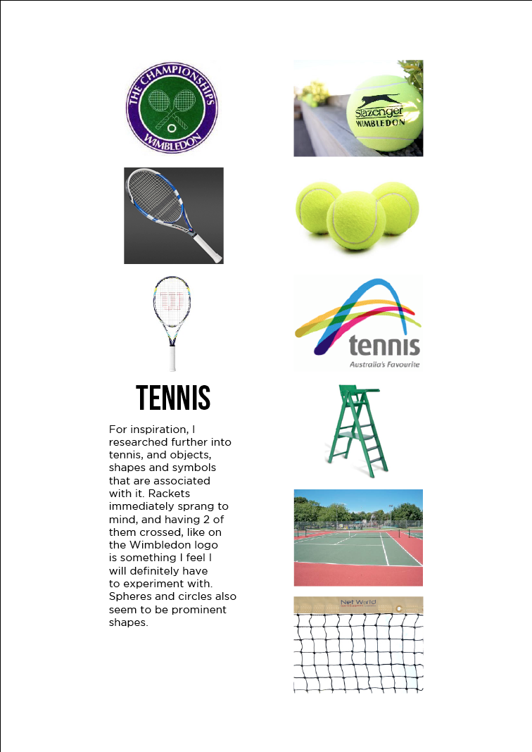
This logo, on the other hand, I found myself surprisingly pleased with. Created using Illustrator, I used a few more unfamiliar, yet useful techniques, such as offset path, rotate tool and textures (though they are much easier to apply in Photoshop). Removing the lack of impact issue present in the previous final piece, this logo is an instant improvement. The main issue I have with this logo is the crossed rackets in the background. This is something I thought about before I did my second set of research, finding that the Wimbledon logo shares this as well, despite this I decided to take this forward, because frankly, it was one of the only things I really wanted to take forward from my ideas. In the end I feel the whole thing works however and shows developed skill on my part, being able to apply smaller details that might be individually overlooked but together help to create a successful final piece, such as the text in the center green circle of the gradient in the outer ring.

Monday 3 December 2012

Alternative Techniques-Part 2

Once I finished my placement, I found I still had a couple of weeks to go before the deadline for this brief, so it seemed necessary, as I had not been able to really document the creative process for the Harbour House brief, so complete another branding brief, clearly showing, research, initial ideas, development and final ideas.
Having chosen a brief I was provide with from my lecturers, designing a logo for Blaydon Tennis Club, I felt that, in addition to my previous branding research, I would add some into sports logos and objects associated with the sport of tennis. The poor quality of logos specifically for tennis that are present now gave me some hope that I might be able to create something that stands out, though, that being said, I was struggling to think of logo ideas that clearly should it represents tennis.

Monday 26 November 2012

Alternative Techniques-Harbour House

Using Illustrator I was able to create all of my logo ideas for Harbour House. The client had said that they liked the use of negative space in logos, and so I thought I would focus on that as a starting point. Clearly my first idea was far more successful then my second. Playing on the House part of the company name, I used the direct selection tool to manipulate a H into a house structure, and then used the shapes tools and pathfinder tools to create a small door silhouette to complete the house as it was not very obvious that that is what I was going for without it.
I then looked into using basic shapes and type to create a clean, simple logo which I feel I did rather successfully, with the addition of a gradient to finish it off. I then returned to my first idea after thinking about trying to give the negative space house a 3D effect, and while I feel the result is not all that bad, the original idea is far superior.
I then created several ideas focusing mostly on the type, using different fonts and techniques to manipulate and create a range of different ideas.
Finally, I thought it would be worth exploring the use of shape in logos, and after some research, I saw that many shapes are created using the ellipse tool to create clean curves. Using this and the rotate tool, I was able to create two, very similar, ideas.
After I had create some logo ideas, I tool the best and placed them into different branding formats, such as, business cards, compliments slips and letter heads. The business cards I was especially happy with thanks to the ideas of having pieces cut out to give the business cards a unique aspect.
As you can see, my work placement gave me plenty of time to work on logo ideas and place them in different elements, experimenting with different ways to present them on said formats, which is something I rarely leave myself the time to do.

Work Placement-The Point Design

I have now finished my three week work placement at The Point Design and I have to say, it has been a very educational and insightful experience. First and foremost, I learned a great deal about the way the industry works within a company, how everyone collaborates on ideas and produce individual elements, bringing them together to create the final piece and how clients are handled, with much back and forth between client and designer.
I also learned some useful techniques within Photoshop, such as how to cut out images using the pen tool and how everything needs to be saved in terms of file sizes for the benefit of the client. I also had a lot of time to work on a branding brief for a company called Harbour House, all of which will contribute greatly to my Alternative Techniques university brief.
Overall I would say that my time spent on placement has provided me with invaluable knowledge about the world of industry and has helped prepare me for a future in graphic design.

Tuesday 6 November 2012

Alternative Techniques-Research

My work placement at The Point Design will be consisting mostly of Branding work, as such, like any other university project, in preparation for my placement work and work for this brief once the placement is over, I began conducting research into branding.
As part of this brief, it was important that we complete a SWOT analysis and list 4/5 skills that we wish to improve within the are of graphic design we have chosen.
I then created style sheets for research into different modern trends in branding, looking into negative space, clean and simple, traditional style logos and logos that use shape. I was very important for me to complete this research, rather then my usual format of having a base idea and researching into that area, I researched into modern trends to form a base idea. This will refine my creativity into ideas that are more suited to today's interests.
Once I was familiar with the modern trends circulating around branding, I thought it would be best to research into different design styles, artists that work in branding and brands that I find visually appealing to help generate future ideas.
I found this batch of research particularly useful as I feel I delved much deeper into the area of graphic design I will be working in then I normally do, especially when it comes to what is popular right now in these areas.

Monday 5 November 2012

Alternative Techniques-Brief

The next brief I have been given on my course is named Alternative Techniques. The brief requires me to pick an area of graphic design I am interested in or perhaps want more practice with and complete a brief around that area, whether it is one I find myself or I use on of the briefs I have been given. Due to my work placement which starts tomorrow however, I will be doing things slightly differently. Rather then picking an area of design, I will attend my placement, and up on completing work there, I will form my project around that work. So say I worked mostly on branding at my placement, I will say that the area I am developing for my university brief is in branding. I will then incorporate this and, provided I have time, another branding brief into my overall project.

Family Explorers-Final Logo

Family Explorer-Final LogoFamily Explorer-Final Logo

Family Explorer-Final Logo

Family Explorer-Final LogoFamily Explorer-Final Logo
Following a look at my last change, I was then asked if I could a second outer ring to the logo, which, as you can see, was a definite improvement. Using some of the colour from my previous selection, as requested, I created this final design in five colour variations. Unfortunately, despite my logo being the one they have chosen to use, I will on a work placement for the next three weeks starting tomorrow and so will be unable to further work on the Family Explorers project until after that point.

Thursday 1 November 2012

Family Explorers

At the end of the last project, myself and several other from my class were given the opportunity to develop the brand for a new group known as Family Explorers. The company goes around to country, visiting many industries, usually school, and organises visits to many cultural hubs around the country, the Baltic being one of them. The group are targeting both children and their parents, trying to encourage them to take these visits as an educational experience.Part of what they do is give a booklet that will be used as a map where they will be able to mark where they have been and where they still have left to go. The brand then needs to reflect what the company does while appealing to both children and adults.
Straight away, after being given this brief, I had the idea of creating a logo with a stamp effect, i.e. text with a faded, worn edge based on the idea of a passport stamp. Using a free font that already had the desired effect, I altered it slightly in places, created the framed corners using the rectangle tool and the Pathfinder unite tool, then added the divider for the text using the rectangle and star shape tools. Using the add/subtract anchor point tools and the direct selection tool, I was able to create the faded effect I was after on all of the different elements of the logo. The corners helped to reinforce the stamp idea and the star at the center helped to show the child side of the logo further.
Family Explorers-Idea 2
Family Explorers-Colour options
After some feedback from the people who are after the logo, I came back and change my logo design slightly, taking away the sharp corners and replacing them with a circle. Created in the same as before, I found, as they desired, gave much a friendlier aspect to the logo, still having the stamp effect, the removal of the corners was a definite improvement.

Monday 29 October 2012

Final Packaging Designs

In the end then, I was able to digitally produce 3D visuals of my packaging ideas, incorporating the base packaging and the logo ideas I developed.
Final design 1Final design 2
Due to the packaging itself being so basic at first glance, I thought that the uneditied version of the Phonica logo placed at the centre of the box would suit it best with only the addition of the black border to give the packaging more impact. I also showed how the packaging would be unveiled to reveal its contents in a more interesting way then just tearing the box apart. This packaging would be lifted to reveal the stand and vinyls/CD's inside.
Final design 3Final design 4
The alternative to the above packaging, the idea, as previously mentioned, was to have the choice between these two packaging designs depending upon the want/need for the stand or not. After some testing with the chosen logo alterations, I found that this design suited the packaging more then others. I also added the line and dot that are present on the Phonica logo to the spools that the strings wraps around which I thought helped to further represent the company on the packaging.
final design 5final design 6
Keeping in line with the Phonica style of a fresh, clean look, I the outwards fading Phonica logo with nothing else. As with the other designs, this black and white look keeps in line with the Phonica website which is very simplistic and contemporary in terms of colour palette. This packaging was the basic idea for the speakers that are available on their website. While the actually speaker packaging will no doubt come in several sizes, in my experience, the boxes tend to be a similar rectangular cuboid shape, as such I designed one packaging design that can be scaled to fit the different sizes. I also showed, once again, how the packaging will be opened, revealing the delivered item and peripherals that come with it (thank you cards etc).
final design 7Final design 8
Lastly, I created the final packaging designs for the artwork packaging. Once again using the original Phonica logo, but in a more unusual way. Having the 'n' in 'Phonica' placed across the divide in the packaging, I used the dots beneath it as finger holes to easily open the packaging once the tape had been removed. Doing so would show the artwork, secured in a tray with small divets for easy access. On the inside of the doors to the packaging, like the speaker packaging, would be any additional peripherals secured by two corner tabs so that they are not loose during transportation.
Overall I am pleased with the actual packaging ideas, the execution however is something that has let me down I feel. Having spent too long on development, I have let myself down in the actual presentation of the final ideas due to lack of time. While the packaging is going to be black and white, the way I have constructed the final pieces has left them looking somewhat unfinished. Hopefully I will come back to these in the future and will learn from this time management error of mine.

Monday 22 October 2012

Phonica Logo alterations

Once I was pleased with the actual packaging mechanics, I moved my attention to what would be placed on the packaging. Thanks to my research, I was aware that the Phonica website was very clean and modern in appearance, reflecting the actual Phonica logo nicely. I wanted to show this style in the packaging, so I thought I would keep everything very simple by changing the logo in different ways and not adding anything major to the design of the packaging besides the occasional border.
Using by simple techniques and combinations, I was able to produce these variations of the Phonica logo to be placed on my packaging ideas. I used very basic techniques such as simple copy in paste, scaling, changing opacity and using Pathfinder tools to create all of these designs. While the techniques were very basic, i'd like to think that I used them quite creatively to create these pieces.