Once I was pleased with the actual packaging mechanics, I moved my attention to what would be placed on the packaging. Thanks to my research, I was aware that the Phonica website was very clean and modern in appearance, reflecting the actual Phonica logo nicely. I wanted to show this style in the packaging, so I thought I would keep everything very simple by changing the logo in different ways and not adding anything major to the design of the packaging besides the occasional border.

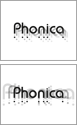


Using by simple techniques and combinations, I was able to produce these variations of the Phonica logo to be placed on my packaging ideas. I used very basic techniques such as simple copy in paste, scaling, changing opacity and using Pathfinder tools to create all of these designs. While the techniques were very basic, i'd like to think that I used them quite creatively to create these pieces.
No comments:
Post a Comment