Wednesday 15 May 2013

Business Cards Ordered

Once my cards were designed, I began my search for somewhere to get them ordered, but, as previously mentioned, I wanted my cards to be letter pressed. After looking around for different places with different prices, the process of letter pressed printing was clearly more expensive. After looking at many places, I chose to go with The Paper Mint Press. While there prices were a little more expensive (not my much mind), their website was easily the most professional in appearance which gave me confidence in their ability.
I now just have to wait.

Tuesday 7 May 2013

Business Cards

As part of the up and coming final show for Graphic Design at Newcastle College, I have finished my designs for my own, personal business cards. Using the logo I developed some time ago that is currently only present on this blog as the focus of the designs.
Upon completing my business card designs, I considered the possibility that the business cards may suit being letter pressed. The bold geometric style should lend itself quite nicely to this style and will generally help my business cards stand out amongst the rest.

Monday 29 April 2013

Computer Arts

Today I bought myself 4 editions of Computer Arts magazines so that I can continue to educate myself and learn new skills in design over the course of the summer. Each month Computer Arts brings out new issues for designers to inform and inspire them in different areas of graphic design. Each edition holds a wealth of creative knowledge, whether it be for design ideas, skills to be learned in Photoshop, Illustrator, InDesign or other creative programs as well as advice from people in industry.


When deciding which editions to purchase, I thought it wiser to split my interests. My reasoning behind purchasing the Graphic Design and Illustration editions was so that I may further educate myself in the areas I am more interested in, where as my decision to purchase the Typography and Self-Promo Handbook editions was focused on educating myself in areas of design I am weaker in or simply do not know a great deal about.
My hope is that, with the help of these magazines, I will return to education for my third year as an all round stronger designer.

Monday 22 April 2013

Portfolio update

After receiving some much needed criticism from tutors and peers I decided I would spend some more time focussing on my portfolio layout and order. Fortunately, not a great deal was suggested to be changed from what it was. First of all, it was recommended that I did something about the white border around my final pieces. The crop marks I had added gave my final pieces a thin white border. It was suggested that if I was going to use a white border, it should be much thicker, perhaps and inch or two. Rather then this however, I decided to remove the white border completely. This gave my pieces a much cleaner, bolder look, making each piece large enough for anyone viewing my portfolio to see my pieces is full detail. 

It was also suggested that I did something about my packaging brief. It has previously taken up two places in my portfolio, using four final designs. This project is arguably the weakest in my portfolio and so, did not justify taking up so much room. To resolve this I removed two of my designs and filtered this project down to one page. After which I also aligned my final outcomes somewhat more concisely.

Finally, I needed to place my newest brief in my portfolio. I feel that this is without a doubt one of my stronger pieces and adds more variety to my portfolio, but it also more accurately resembles the type of work I prefer to do.

In the end I am pleased with my final portfolio. It starts and ends very strongly, and each project in there holds there own with a place in my portfolio. The order in which they are placed gives my portfolio I smooth flow when looking through. Each final piece is placed large and in high quality so that each detail can be seen.

Monday 15 April 2013

Self Branding Logo

My logo

As part of my portfolio, I felt the need to make my own personal logo the very first page, however, it needs to be re-created. Based on a piece I had created in the past out when I was bored, I created the base shape at the top of my logo. This piece was created in Illustrator using the pen tool, ellipse tool, offset path and rotate tool. Honestly, the process is quite simple, only half the design needs to be made, the other can be reflected. The result however, I find to be quite a complicated looking, but aesthetically pleasing. I then hunted around for a font that would work well with this construction. Eventually I stumbled across the font 'Speakeasy' which is the font you can see above. After spending a great deal of time working with alignment, structure and kerning of the text, I eventually settled with this final logo. My intention for this logo was to have it placed on the first page of my portfolio. Seeing as the portfolio is selling myself, it only made sense to me for my logo to be the first thing anyone looking through my portfolio should see. This will spill over to more then my portfolio however, this will be placed as the header for my blog, will be going on my business cards and, if I get around to making one, will go on my website.

Monday 8 April 2013

HEX-Clothing Designs

Following the completion of my capsule collection branding, I shortly moved onto clothing designs. During the development of my brand, I was already aware of several ideas I wished to create. Like my logo text, I knew that the majority of my designs would be created using a graphics tablet to help their styles match that of the brand. I had several desires for these clothing designs since the creation of this brief, trying to push the boundaries on the placement of my designs, 
Example 3
The first idea I chose to create was that of an octopus, something I have been drawing whenever I was bored for a long time now. I knew the tentacles would be one of the most features if this is what I wanted to draw which lead me to the idea of having one wrap around one of the sleeves. As I mentioned, I wanted to try more unusual design placement with my designs because of the amount of common placements that are available today. This resulted in the entire design being placed in the upper right of the shirt, not only does this achieve my desire for unusual placement, but it allows my wrapping around the sleeve idea to be created more easily. To help make this shirt more recognisable as part of this HEX brand, I felt the need to connect the two in a obvious way. I added a globule of ink, appearing to be launched by the octopus placed roughly in the centre of the shirt. Within this I removed the filled black, constructing the word 'Hex' in the process. While I do personally love this design, in terms of practically, this would be very difficult to create in practice due to limitations with common printing. The process behind creating this piece involved me simply sketching the image straight onto this stock image using a graphics tablet. This process took some time but in the end achieved great looking results despite its real life impracticality. This process took too long however to justify it being used for future designs. This also has the limitations of being difficult to to transfer from one stock image to another or across to other clothing items. For the future designs, I decided I would construct them separately and then focus on placement upon completion.
Design 1Design 3

Design 4Design 2

I ended up creating four new designs (to go along side the HEX logo) to be placed on clothing. I decided the basic idea for each design during the construction of my brand logo and now had reached the stage where I would create and add to each idea.
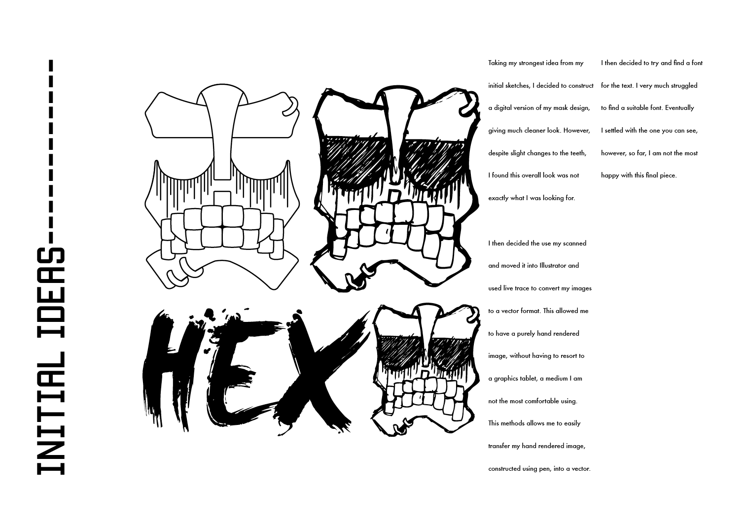
The first idea (top left) was an attempt to create another tiki mask style image, crossing over with a oni mask theme. Once the design was complete (again using the graphics tablet) I placed the HEX text between the horns to fill the gap where something appeared to be missing. The second design (top right) was based on my desire to draw an owl like design. There was some cross over between this and the last with the noticeable feature of the horns, developed slightly more this time around. I wanted to keep this idea looking more simple then the last, using the horns to still draw the viewers eye. My following idea (bottom right) was another owl based idea. Trying to add a little variety in the style of my designs, I paused my use of the graphics tablet and instead constructed this piece using the pen tool in Illustrator. One of the most recognisable features of owls are their large eyes, this is something I wanted to maintain in this design, using gradients to help these stand out further. For my last design I decided to take a different route from my sketch style, this time leaning towards the use of shape, like that of my logo. Quite simple to make, using the pen tool and ellipse tool, I constructed my last design.

Example 6Example 2

Example 4Example 1

Example 5
Placing everything in situ was a rather time consuming and delicate process, but in the end, I was very pleased with the majority of the results. For each piece of clothing I placed the tiki mask design below the neck at the same place at the same size. Depending on the colour of the item of clothing, I altered my designs to black or white. My four designs from above were fairly simple to place, I leaned towards as large as I could place them. On the hoodie designs however, I added something to the actual hood, whether it was the horns that matched the designs or a segment of my shape design. I also had the idea of having my HEX logo wrap around the body of each clothing piece, which, while it would also be difficult to practically create, the design itself is something I found quite successful.

Layout

Monday 1 April 2013

HEX logo Final

HEX logo
After taking some time to step away from my logo development, I came back with fresh eyes and took another stab at developing this logo into a successful piece.
HEX logo 4
My first attempt took my second logo idea across to photoshop to for a hand rendered re-working. The idea of the overlapping characters still appealed to me at this point hence my pushing of the idea. However, during the construction of this logo I ran into several problems, the most crippling being the lack of legibility of the text when it was all black. After adding the white stroke (by hand) and taking a step back, I felt that the logo had become far too busy, if presented small anywhere, I feel it would become unrecognisable.
HEX logo 5
In the hopes of solving this issue, the only solution I could think of was to take a step backwards and remove the white stroke again, then rearranging the characters so that they  remained legible. Despite this solution however, my overall feelings towards this logo remained unaltered.
HEX logo final
I soon felt that my feelings towards this design idea would be incorrigible and so decided to revert back to my original logo idea, this time however, rather then spending hours searching for a font that would work, I took it upon myself to create a suitable font using the Graphics tablet. After spending some time trying to get the style to match that of the mask design I soon settled on the italic upper case type that you can see above. The type works well with the tiki mask, because they were both made by my hand and so share the same sketched effect. By extension, my future illustrations for clothing should work well with any logo placement I do and will match the brand.

Monday 25 March 2013

HEX-Initial Ideas

Following my research and name generation, I jumped straight into my initial ideas for my brand. I was leaning towards some sort of tiki mask style image to accompany text and so I created several designs.
Although overall I was happy with my final design following that line of idea with the tiki mask design, I came up with this idea of overlapping letters coupled with the more traditional style circular look. Although this is a severely under developed idea, I think, provided I can make it a successful piece, I am leaning more on towards this ideas for the brand.