Monday, 29 October 2012

Final Packaging Designs

In the end then, I was able to digitally produce 3D visuals of my packaging ideas, incorporating the base packaging and the logo ideas I developed.
Final design 1Final design 2
Due to the packaging itself being so basic at first glance, I thought that the uneditied version of the Phonica logo placed at the centre of the box would suit it best with only the addition of the black border to give the packaging more impact. I also showed how the packaging would be unveiled to reveal its contents in a more interesting way then just tearing the box apart. This packaging would be lifted to reveal the stand and vinyls/CD's inside.
Final design 3Final design 4
The alternative to the above packaging, the idea, as previously mentioned, was to have the choice between these two packaging designs depending upon the want/need for the stand or not. After some testing with the chosen logo alterations, I found that this design suited the packaging more then others. I also added the line and dot that are present on the Phonica logo to the spools that the strings wraps around which I thought helped to further represent the company on the packaging.
final design 5final design 6
Keeping in line with the Phonica style of a fresh, clean look, I the outwards fading Phonica logo with nothing else. As with the other designs, this black and white look keeps in line with the Phonica website which is very simplistic and contemporary in terms of colour palette. This packaging was the basic idea for the speakers that are available on their website. While the actually speaker packaging will no doubt come in several sizes, in my experience, the boxes tend to be a similar rectangular cuboid shape, as such I designed one packaging design that can be scaled to fit the different sizes. I also showed, once again, how the packaging will be opened, revealing the delivered item and peripherals that come with it (thank you cards etc).
final design 7Final design 8
Lastly, I created the final packaging designs for the artwork packaging. Once again using the original Phonica logo, but in a more unusual way. Having the 'n' in 'Phonica' placed across the divide in the packaging, I used the dots beneath it as finger holes to easily open the packaging once the tape had been removed. Doing so would show the artwork, secured in a tray with small divets for easy access. On the inside of the doors to the packaging, like the speaker packaging, would be any additional peripherals secured by two corner tabs so that they are not loose during transportation.
Overall I am pleased with the actual packaging ideas, the execution however is something that has let me down I feel. Having spent too long on development, I have let myself down in the actual presentation of the final ideas due to lack of time. While the packaging is going to be black and white, the way I have constructed the final pieces has left them looking somewhat unfinished. Hopefully I will come back to these in the future and will learn from this time management error of mine.

Monday, 22 October 2012

Phonica Logo alterations

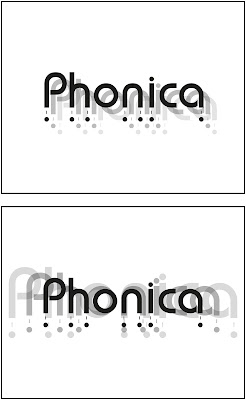
Once I was pleased with the actual packaging mechanics, I moved my attention to what would be placed on the packaging. Thanks to my research, I was aware that the Phonica website was very clean and modern in appearance, reflecting the actual Phonica logo nicely. I wanted to show this style in the packaging, so I thought I would keep everything very simple by changing the logo in different ways and not adding anything major to the design of the packaging besides the occasional border.
Using by simple techniques and combinations, I was able to produce these variations of the Phonica logo to be placed on my packaging ideas. I used very basic techniques such as simple copy in paste, scaling, changing opacity and using Pathfinder tools to create all of these designs. While the techniques were very basic, i'd like to think that I used them quite creatively to create these pieces.

Monday, 15 October 2012

Packaging Designs + Nets

Thankfully, my research gave me a flurry of ideas to work with for my packaging. Before beginning however, I felt it would help if I knew what items I was going to design packaging for. Rather then designing packaging just for Vinyls/CD's, I thought I would also design packaging for the speakers they sell and for the Vinyl/CD artwork they sell. This would give me the opportunity to create packaging for several different shaped and sized objects.
While working on my initial ideas for the vinyl/CD packaging, I was torn between two packaging designs, this above being the first. The ideas here is that the outer packaging, what you would see through that comes through the post, is very simple, just a rectangular cuboid. Removing this however would reveal a triangular stand with the vinyls/CD's that had been ordered (up to five). These stands could be collected to create a neat stand for a vinyl collection. I also, as I have done for the rest of my packaging ideas, created the net for the packaging. Naturally this packaging is extremely simplistic, the only defining feature it the fact it is missing a face, which they base of the triangle will replace. While this brief is based on the packaging that comes through the post, it is also important to make the unpacking experience as unique as possible, so while the packaging looks basic, the experiences of this triangular plastic stand which can be used and collected to hold future vinyl/CD purchases is quite unique and strengthens this idea.
This was the other strong contender for the vinyl/CD packaging, a folder style design. Un sure between and the previous idea, I came up with the idea that, when purchasing vinyls from the Phonica website, you could choose between these ideas. If say you wanted two vinyls and you chose the stand packaging, on your next order which may be another two vinyls, you could chose this packaging so that you do not receive another stand which will remain empty. This packaging is both unique in design and highly compact, once again holding up to five vinyls. The packaging net looked quite complicated and I found it hard to show without separating it into parts, the semi circles show the folding mechanisms, the large two for the lid and the smaller for the file all will act and seals on the side of the packaging, preventing the vinyls/CD's from falling out. The four rectangles represent the dividers that will help to protect each individual vinyl on delivery. The other defining feature of this packaging design is the string fastener which will seal the packaging, using the Phonic dash and circle to both reinforce the Phonica brand and keep the packaging looking modern despite using this vintage seal.
By far my best design for the speakers. This idea is to have the packaging sealed by clear tape, upon tearing, the packaging, which is split in two halves, can be pulled so that the halves fall either side, leaving the speaker box stand up as well as the more rigid triangle parts of the packaging. The idea is simple, but I imagined that, once the sides fall down, seeing the product simply standing there, framed still by the triangles, might be quite the unique packaging experience. The net was simple to enough to construct, the only tabs involved are to join the top faces of the packaging to the sides.
Lastly, I chose this design to take forward for my artwork packaging designs. The idea here is that the top of the packaging is like two doors that, once the tape is removed, will be opened to reveal the artwork facing the owner. This idea and the speaker packaging idea will include tabs that will hold down any peripherals, such as Thank You cards, in place on the inside of the packaging, so that, when the sides fall/doors are opened, the packaging and peripherals are immediately visible.

Tuesday, 9 October 2012

Packaging Brief-Research

After some debating, I eventually settled on designing the packaging for Phonica Records. I thought that designing packaging for what will mostly be flat, large shapes would be both interesting and challenging.
Beginning my research, I thought the best place to start would be looking further into Phonica as a company, looking at their website and the products they sell. Naturally, the bulk of their products reside in Vinyls and CD's but they also sell products such as headphones, speakers, album artwork etc.
Looking on the website surprised me, I found that, although they sell the vintage product of vinyls, the website was actually vert modern, clean and sleek, not quite what I was expecting. They appear to tried to bring this product into the 21st century, maintaining this look and feel is something I feel is worth maintaining.
I then moved on to looking at competitors in a similar market for further inspiration.
After that, I created a style sheet to show all the different elements of packaging I should consider when designing my ideas.
I thought about two companies that I regularly purchase from that both arrive with unique and interesting packaging. Made in Hell arrives in a clean black bubble-wrap covering, filled with the product and many peripherals such as badges. Colus comes in a white cardboard packing with their logo printed large on one side, the shirts of wrapped in black tissue paper, sealed with a sticker that reads the buyers name.
Lastly, I looked into examples of packaging, pointing out different features of interest that could influence my initial ideas process.


Tuesday, 2 October 2012

Lurpak packaging

Before making a start on the main part of the brief, we were given the task of looking into a specific brand that could be considered dated in appearance and is due for an upgrade. The task was collaboration based, working in small groups of 3-4 to produce research into the chosen brand and design idea(s) for the new brand packaging. Me and my partners, after completing the research part of the task, set out design an idea each, bouncing ideas back a forth, something we were all used to as it is common practice between us in previous projects. We then produced a presentation to show what we created over the week...